
My Top Farrow & Ball Colour Choices for 2026
If there’s one thing shaping the interiors landscape in 2026, it’s a joyful return to warmth, texture, and personality. After years dominated by cool neutrals and sterile whites, designers and homeowners alike are embracing colours that feel alive — earthy, comforting, and richly soulful.
This year, the palette leans toward warm terracottas and soft pinks, muted neutrals with character, and unexpectedly uplifting shades that infuse spaces with joy and light. These tones perfectly suit heritage homes, contemporary schemes and interiors that want to feel collected, cosy and timeless. Values at the heart of heirloom interior design.
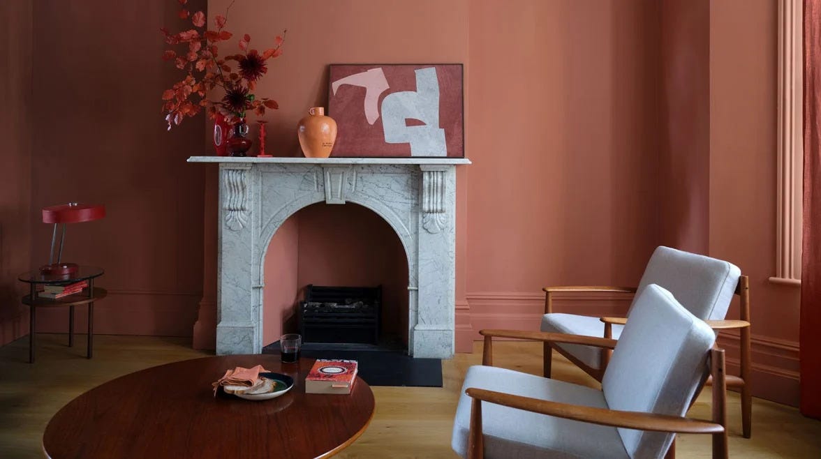
Earthy Terracottas and Clay-like Warmth
Warm, baked earth tones are everywhere in 2026. Think Mediterranean clay, rustic terracotta and sun-baked adobe inspired hues that anchor spaces with a comforting, rooted feel.
These tones work beautifully on walls, accent niches, or even colour-drenched cabinetry. They pair effortlessly with natural materials, timber, woven textiles, and artisan ceramics, creating a sense of handcrafted heritage and grounded sophistication.
Farrow and Balls Red Earth works perfectly to inject cosy warmth into spaces.
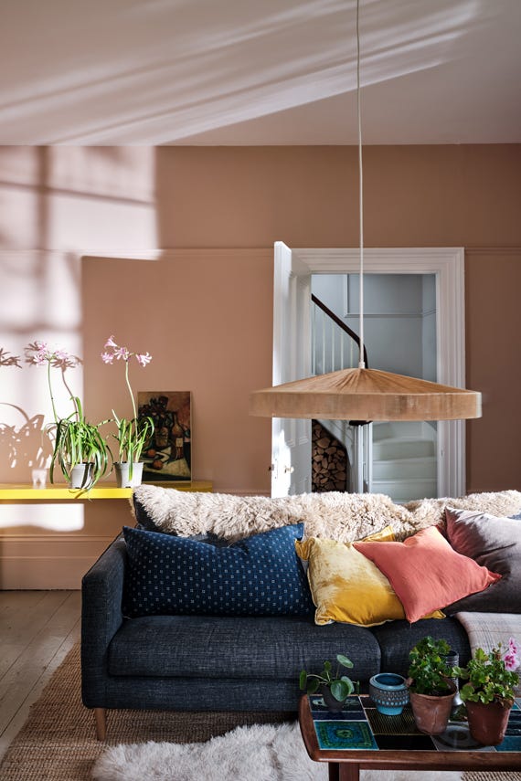
Rosy, Warm Pinks: Soft and Sophisticated
Farrow & Ball’s soft plaster and pink-toned neutrals continue to make waves. Colours like Setting Plaster and Dead Salmon bring warmth with subtle complexity, dusty, rosy nuances that read as neutral but feel richer and more tactile.
These shades are ideal for living rooms, bedrooms or anywhere you want a gentle, embracing backdrop that doesn’t feel cold or washed out.
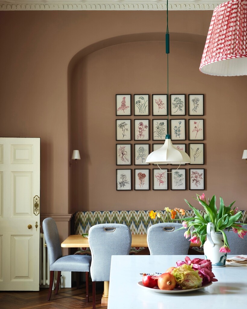
Rich Neutrals With Character
The definition of a “neutral” has shifted. Gone are flat beiges and cool greys, instead, designers reach for tones with depth and warmth, like a neutral with a whisper of pink, brown or earth. Farrow & Ball’s Dead Salmon is a perfect example of this trend: intriguing, versatile, and far more interesting than a pale grey or cream.
This evolution reflects a broader shift: neutrals that feel like home, not just an empty backdrop.
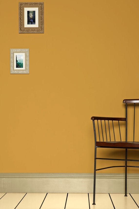
Joyful Yellows for Light & Energy
Yellow isn’t just for accent pieces anymore, it’s stepping into interiors with confidence. Farrow & Ball’s Sudbury Yellow is a classic mid-yellow that cleverly plays with light, brightening up spaces and bringing an unexpected cheerful energy.
In darker rooms or areas with minimal natural light, a touch of yellow can lift the mood and create a sunshine-filled warmth that feels intentional rather than overwhelming.
How to Combine These Hues
Here are a few heartfelt ways to bring these palettes to life:
-
Layer earthy terracotta with warm pinks - rich walls grounded by plaster-pink trims for a cohesive, enveloping space.
-
Use muted neutrals as your canvas - allow them to calm the eye while other tones add depth and softness.
-
Introduce yellow accents in shadowed areas - from furniture to smaller walls, to counterbalance limited light.
The beauty of 2026’s palette is in its flexibility and authenticity. These aren’t fleeting paint trends, they’re colours that feel lived-in, curated and deeply connected to the spaces and materials around them.